Value for Money by Droog Design

‘Value for Money’ was Droog Design’s 13th presentation in Milan (Salone del Mobile 2005), conceived by designers Niels van Eijk and Miriam van der Lubbe. The project’s central question was: “What determines the price of a product?” – Is it the raw material, the manufacturing time and labour, the edition size or uniqueness, or the reputation of the designer/brand? Droog challenged both designers and visitors to link these price-determining factors to a product’s emotional value – qualities like function, form, meaning, comfort, or aesthetics. The goal was to prompt reflection on how monetary value correlates (or conflicts) with perceived value in design.
Frank Tjepkema’s lampshade, which was lasered in 10 minutes, functioned differently from the lampshade that took longer to make. More printing made Maurice Scheltens’ tablecloth more appropriate for more people. The stool by Niels van Eijk & Miriam van der Lubbe could be a chair or even an armchair for the same price when cheaper material is used. By adding other threads to the weave, Christien Meindertsma’s duvet cover gained more visual value and extra comfort. By stacking several copies on top of each other, the visual value of Joris Laarman’s soup bowl increased. In the case of jewellery, emotional value and the value of the material often seemed to coincide. The value of Ted Noten’s brooches completely depended on the weight of the gold.
The project was attended by about 6.000 visitors, and the most remarkable aspect was the way these visitors thoroughly analysed their personal preferences for a particular design. The presentation triggered people to think about what determines the price of a product. Based on the €-signs in hotel or restaurant guides, fictive and relative values were ascribed by Droog to products by using a certain number of €-signs. Using an accompanying publication, the chequebook, visitors actively participated in the presentation and gave their own opinion about the value of the exhibited products, choosing the best design within the presented series.
For five days, a discussion went on, raising various questions: which ideas and concepts are the most important to a good design? Is the ideological value the same as the financial value ascribed to a design? The outcome was often most surprising, and the products valued most by the visitors often deviated from the products most expensive to produce.
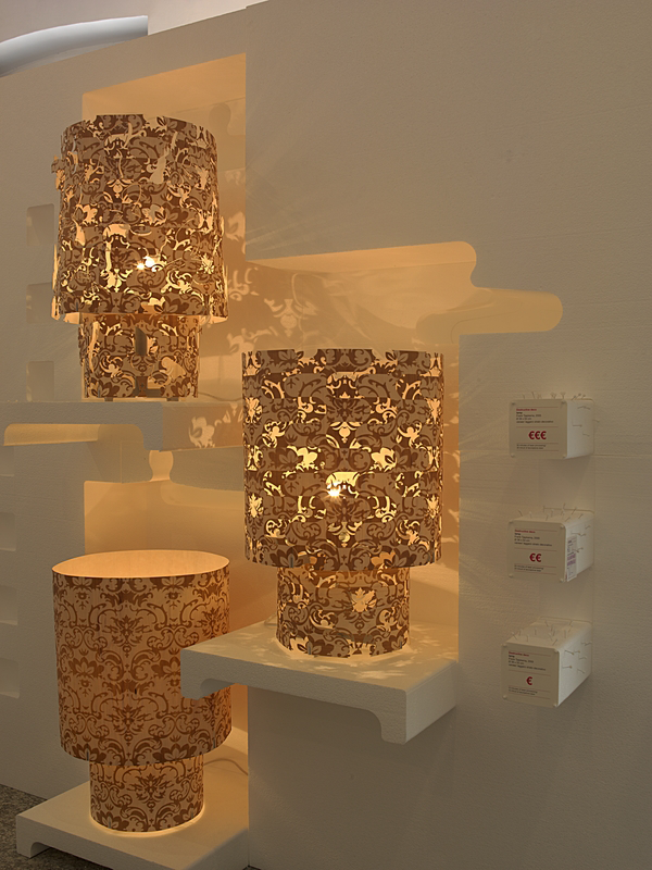
Destructive Deco Lamp Series by Frank Tjepkema
Consists of three plywood lampshades, identical in shape but laser-cut for progressively longer periods—10, 20, and 30 minutes. As the cutting continues, a baroque pattern becomes denser and more chaotic, turning decoration into near-disintegration. Tjepkema describes the machine as unable to stop, letting “patterns become chaos” and “destruction become beauty.” The series challenges the idea that more labour or production time automatically leads to a better product, revealing how excess can both erode function and create unexpected aesthetic value.
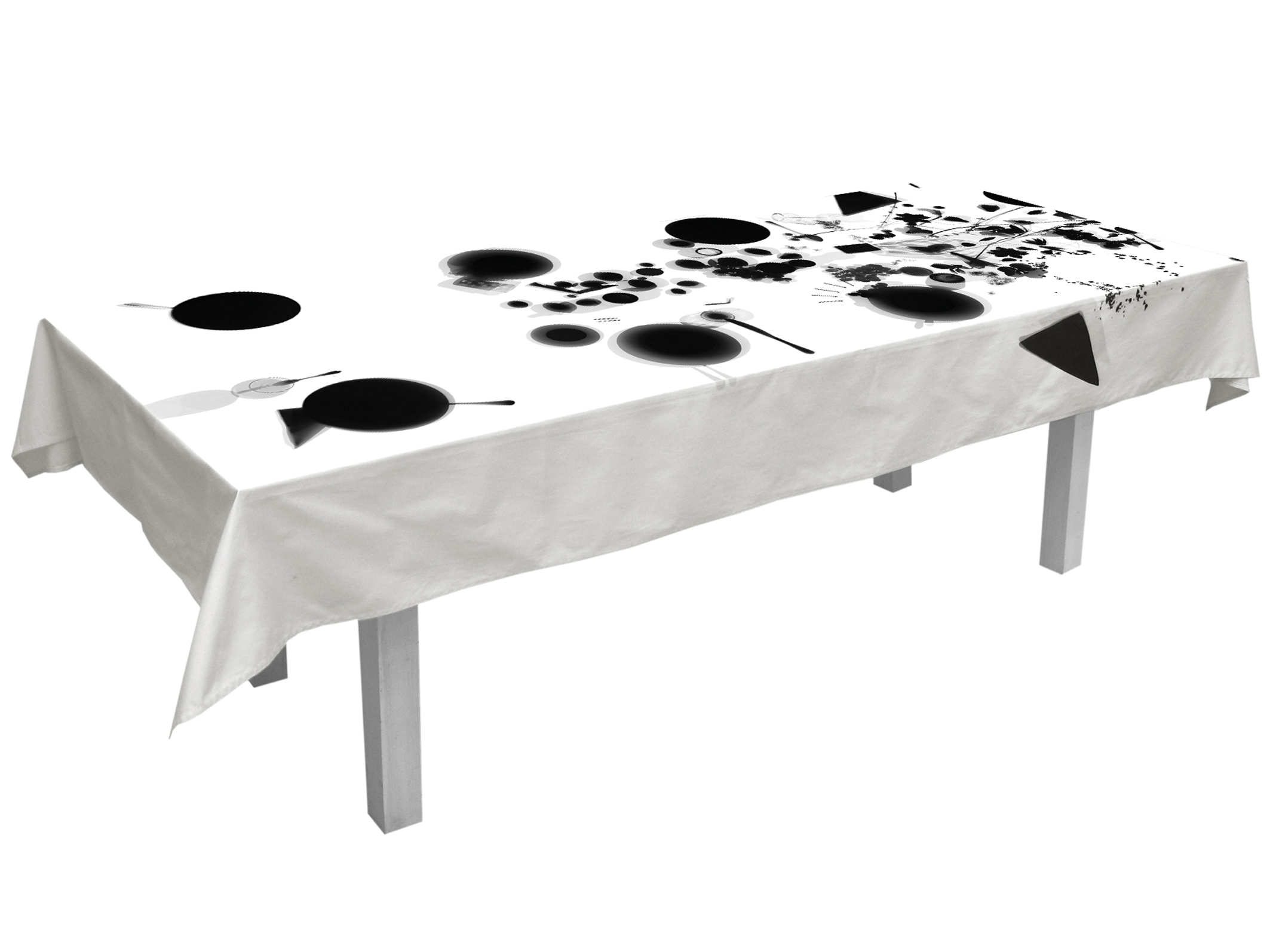
Tableau Tablecloth by Maurice Scheltens
This tablecloth is a white linen printed with black photogram silhouettes that reveal the ghostly traces of a finished dinner—plates, cutlery, and spills arranged like an X-ray of the table. Produced in three versions with increasing amounts of imagery, the series explores how much decoration is “enough” and how added printing affects both appeal and cost. Blending photography with domestic design, the Tableau Tablecloth transforms a functional object into a narrative artwork and is now part of the Philadelphia Museum of Art’s collection.
Twenty-five Euro Stool/Chair/Armchair by Niels van Eijk & Miriam van der Lubbe
Niels van Eijk & Miriam van der Lubbe’s 25 Euro Furniture presents a stool, chair, and armchair — each designed to cost exactly €25. The designers achieved this by scaling down material quality as the pieces grew in size: the stool uses beech plywood, the chair a mid-range underlayment, and the armchair inexpensive chipboard. By equalising the price across different levels of comfort and size, the series playfully questions how we assign value to materials, form, and function.
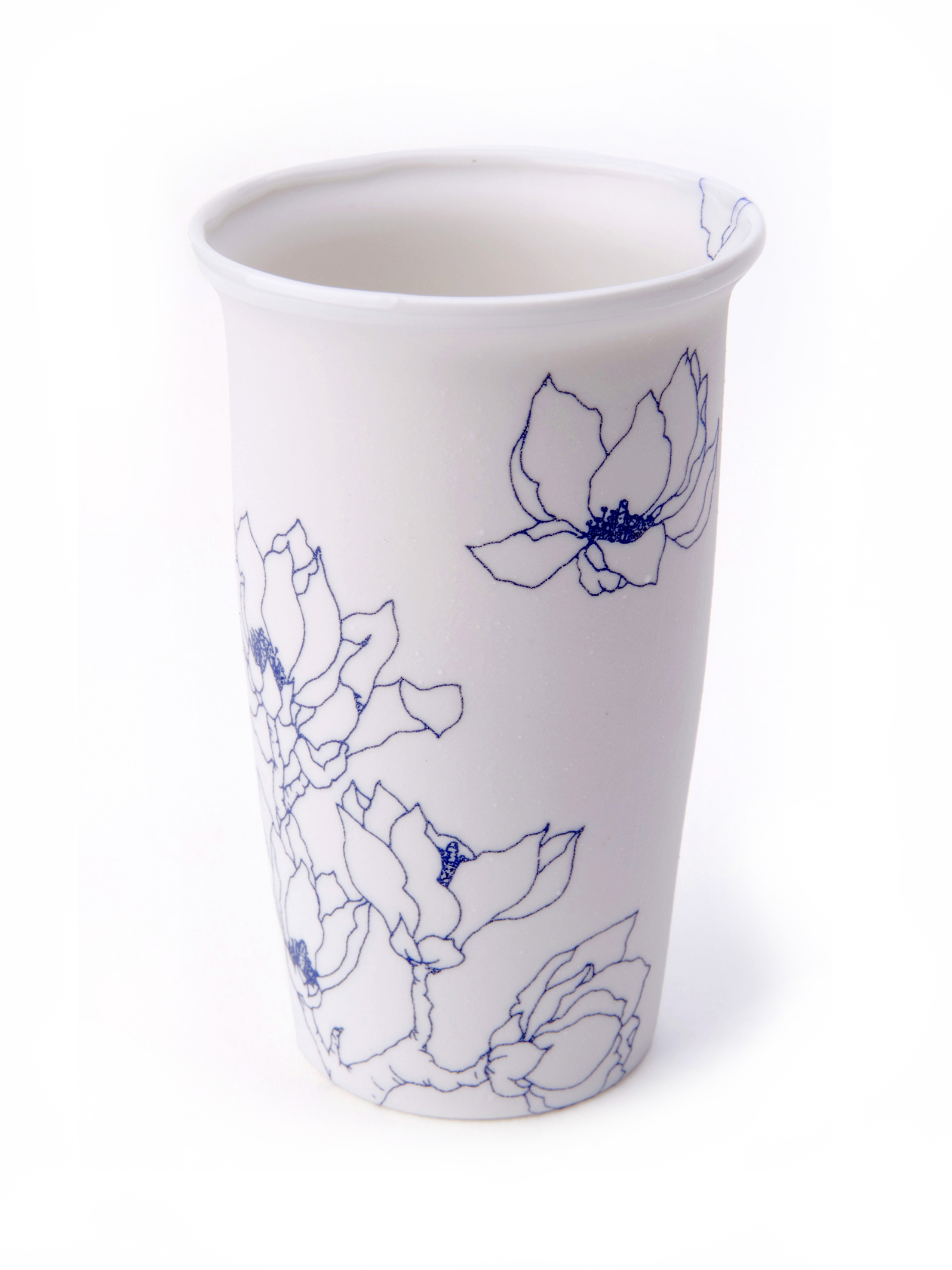
Blooming Over Cup by Mina Wu & Jan B.
The Blooming Over Cup explores how decoration shapes value. Three identical porcelain cups were shown: a plain white version, a second printed with Wu’s blue floral motif, and a third hand-painted and signed by the artist. Each added layer of artistry increased effort, exclusivity, and price. Notably, visitors favoured the mid-priced printed cup as the best balance of cost and emotional appeal, perfectly illustrating that higher labour doesn’t always equal higher perceived value.
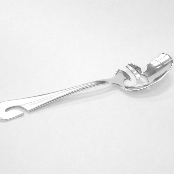
MP/DB Teaspoons by Ed Annink
Ed Annink reworks the classic Dutch Hollands Glad silver spoon to question value and usefulness. MP features only a small hole in the bowl, highlighting how traditional sugar scooping has become obsolete. DB, by contrast, is intricately pierced with a Delft Blue–inspired pattern. Placed side by side, the two spoons invite visitors to decide whether elaborate decoration—and the extra cost it entails—actually increases the value of an everyday object.
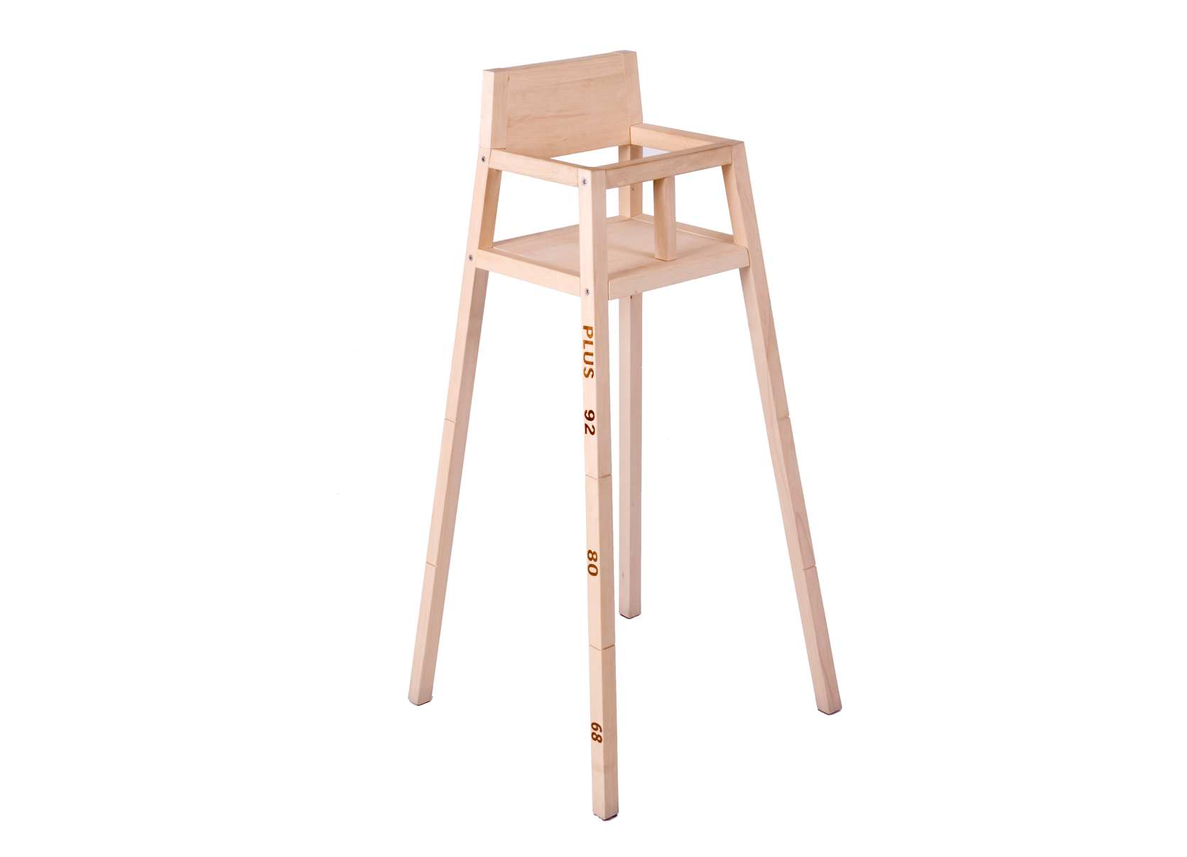
Highchair by Maartje Steenkamp
This highchair offers a playful take on value through longevity. Built in wood with printed height markings, it’s meant to be shortened as a child grows: parents cut the legs at each stage with the included saw and sandpaper. A single chair thus adapts through multiple growth phases. By making purposeful “destruction” part of its function, the design shifts the idea of value toward adaptability and emotional attachment rather than materials or labour.
Value for Money was also shown at Droog, 14 June to 24 July 2005.