

5 tips for good planning during my event
5 tips for good planning during your event
Planning an event sounds simple until you’re standing in the middle of it. The catering runs late. The AV setup takes twice as long as expected. Someone forgot to brief the speaker on timing. Good event planning isn’t about having a perfect script. It’s about knowing where things go wrong, before they do.
These five tips come from what we’ve learned at @droog, running B2B events in a building from 1641 that has hosted everything from theatre performances to panel discussions to private dinners for ten. Design thinking is at the core of everything we do here, and that includes how we think about time, space and flow.
tip 1: start with the flow, not the programme
Most event planners start by filling a schedule. What time does the keynote start? When is lunch? That’s the wrong order.
Start with movement. How do people enter? Where do they go first? What does the transition from one part of the event to the next actually look like, physically? A programme on paper doesn’t tell you that the walk from registration to the main room takes four minutes, or that the corridor bottlenecks when 80 people try to move at once.
At @droog, the grand space on the ground floor connects directly to the garden and the red space. That’s not a coincidence. It means that during a break, people naturally spread out without being directed. Flow is designed into the building. For your event, the same principle applies: design the movement before you design the agenda.
A practical method: walk the entire event yourself before the day. Enter through the front door. Move through every space in the order guests will. Note every moment where people might cluster, get confused, or have to wait. Fix those moments, not with instructions, but with layout.
- Draw a simple floor map with arrows showing guest movement
- Mark every transition point (registration to welcome, welcome to session, session to break)
- Add realistic time buffers to each transition, at least five minutes per move for groups over 30
- Brief your team on flow, not just on tasks
tip 2: match the space to the purpose, not the headcount
The most common planning mistake isn’t picking a space that’s too small. It’s picking a space that fits the number but not the energy.
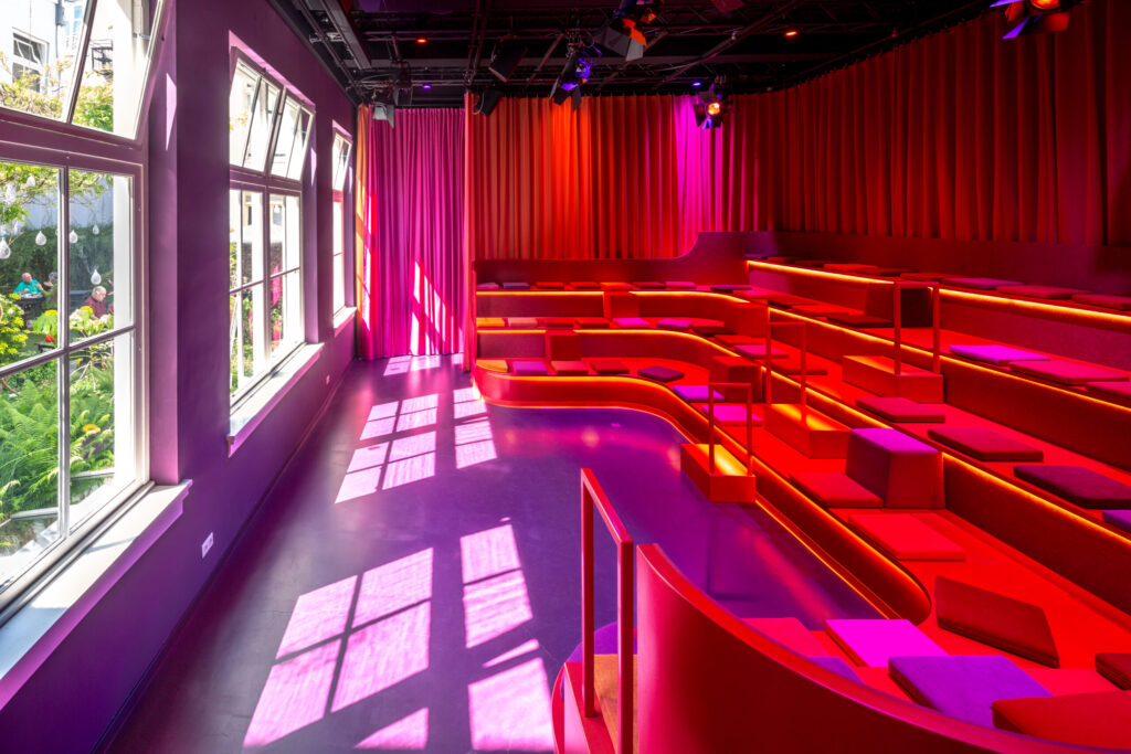
A room that seats 80 feels very different with 20 people in it. The red space here is a good example of this: its u-shaped tribune seats up to 80, but when fewer than 20 people are sitting on it, the space reads as empty. That changes the energy of whatever you’re trying to do. For a small group, you’d want the theatre feeling of a full room, which means either filling the seats or choosing a different space entirely.
The principle: a space should feel right for the number of people in it, not just accommodate them. Too large and there’s no tension, no focus. Too small and people get restless. The sweet spot is a room where the capacity feels slightly full, where there’s enough proximity that conversation happens naturally but enough room that people don’t feel crowded.
Questions to ask when matching space to purpose:
- What energy does this session need? Intimate or expansive?
- Does the layout encourage the behaviour you want (conversation, focus, participation)?
- Will the room feel full or empty at your actual guest count?
- Does the space signal the right thing? A boardroom signals formality, a design space signals open thinking
Different sessions often need different spaces. A morning keynote for 90 people, a breakout for 15, a working lunch for 30: those are three different rooms with three different setups. Events don’t have to live in one space.
tip 3: brief every supplier on the same timeline, with the same document
Miscommunication between suppliers is one of the leading causes of event delays. The caterer thinks setup starts at 13:00. The AV team thought it was 12:00. The venue coordinator has 11:30 in her notes. All three are working from separate conversations, separate emails, and separate assumptions.
One document. Every supplier. Updated in real time.
This doesn’t need to be complex. A shared spreadsheet with columns for time, action, responsible party and status is enough. What matters is that every person working on your event is looking at the same source of truth. When something changes, it changes in one place, and everyone sees it.
At @droog, events sometimes run across multiple rooms: a plenary in the grand space, breakouts in the white space, a private dinner in the library, drinks in the cafe. Each of those spaces has its own setup requirements, its own timing, its own team. A single shared runsheet is the only way to keep that from becoming four separate events happening in parallel without coordination.
What your runsheet should include:
- Load-in and setup times per supplier, per space
- Sound check and tech rehearsal slots (never skip these)
- First guest arrival time, with 15 minutes of buffer before it
- Session start and end times, with hard stops marked clearly
- Break durations, catering delivery moments, Q&A slots
- Load-out and cleanup responsibilities
- Emergency contacts for every key person
Send this document to every supplier no later than five days before the event. Review it together in a 30-minute call. Then don’t touch it, unless something genuinely changes.
tip 4: protect your transitions
Sessions run long. Lunch takes longer than planned. A speaker has three more minutes of material. These things happen at every event. The question isn’t whether transitions will be disrupted. It’s whether you’ve protected them enough to absorb the disruption.
The answer is usually buffer time. Not five minutes between a 60-minute keynote and a 60-minute workshop. Fifteen. Because the keynote ran eight minutes over, the moderator asked two follow-up questions, and 70 people need to walk from one room to another, find their name on a table, and settle in before the next session can start.
There’s a specific kind of transition that planners consistently underestimate: the technical transition. Switching from one presentation to another, resetting a room layout, connecting a new speaker’s laptop to the AV system. Each of these takes time. At minimum, add ten minutes of technical buffer for every major setup change during your event.
A checklist for protecting transitions:
- Add 10 to 15 minutes between every major session
- Assign one person as timekeeper, with authority to interrupt speakers when time is up
- Pre-load all presentations on one device, not each speaker’s own laptop
- Test every AV switch during the tech rehearsal, not on the day
- Have a contingency plan for the session that will definitely run long
Good transitions are invisible. Nobody notices them. Bad transitions are memorable for all the wrong reasons.
tip 5: design the end as carefully as the beginning
Most events are planned from the front. Registration is detailed, the opening is rehearsed, the first hour is tight. Then somewhere around the midpoint, the plan gets vaguer. By the time you reach the closing session, you’re improvising.
The end of your event is what people remember. Not because memory works that way by accident, but because endings carry emotional weight. A strong close, a clear moment of completion, a last impression that lands well: these are what guests take home. A weak ending, an event that just stops rather than concludes, leaves people with a vague sense of incompleteness.
Design the last 30 minutes as carefully as you designed the first 30. This includes:
- A defined closing moment, not just the last session ending
- A clear signal that the formal programme is done
- Something for people to take with them, literally or conceptually
- A plan for what happens next: drinks, departure, networking
- A thank you that names the people who made it happen
At @droog, we’ve seen events close with a drink in the garden, a shared meal in the cafe, and a final round of discussion that moved from the grand space to the library as numbers dwindled. None of those were accidents. They were planned.
One more thing: brief your team on the close as specifically as you brief them on the open. Who dims the lights? Who signals catering to start clearing? Who stands at the door to say goodbye? Small details, but they’re the ones guests remember.
Good planning doesn’t mean controlling everything. It means deciding in advance what matters, building structure around it, and leaving room for the things you can’t predict. The rest takes care of itself.
If you’re planning a B2B event and want to talk through the setup, we’re happy to think it through with you.
frequently asked questions
how far in advance should I start planning my event?
For a B2B event with 50 or more guests, start at least eight to twelve weeks out. That gives you time to confirm the venue, brief suppliers, finalise the programme and still have three weeks of buffer before the day for last-minute changes. Smaller events, 20 people or fewer, can be planned in four to six weeks if the programme is straightforward.
how do I plan an event across multiple rooms?
Start with a single master runsheet that covers all rooms simultaneously. Map out what’s happening in each space at every point during the day. Identify moments where guests move between spaces and assign a coordinator to each transition. Events at @droog often use the grand space, white space, library and cafe in sequence across a single day. The key is one document, not four.
what is the biggest planning mistake event organisers make?
Underestimating transitions. Not the sessions themselves, but the time between them. Technical setup, room changes, guest movement, AV switches: these eat into your programme faster than almost anything else. Build in more buffer than you think you need, then protect it.
how do I choose the right room setup for my event?
Match the layout to the energy you need. Theatre-style for focus and presentation, round-table for discussion and participation, standing for networking and energy. Then check whether your actual guest count fills the room or leaves it feeling empty. A room that seats 80 with 15 people in it has a very different atmosphere than a room built for 20 with 18 people in it.
what should I include in a supplier briefing document?
Setup times, access instructions, technical requirements, the runsheet, contact details for the venue coordinator, and a clear point of contact for the day. Send it at least five days before the event and follow up with a short call. One document, shared with everyone, updated in one place.
can I use multiple spaces at @droog for a single event?
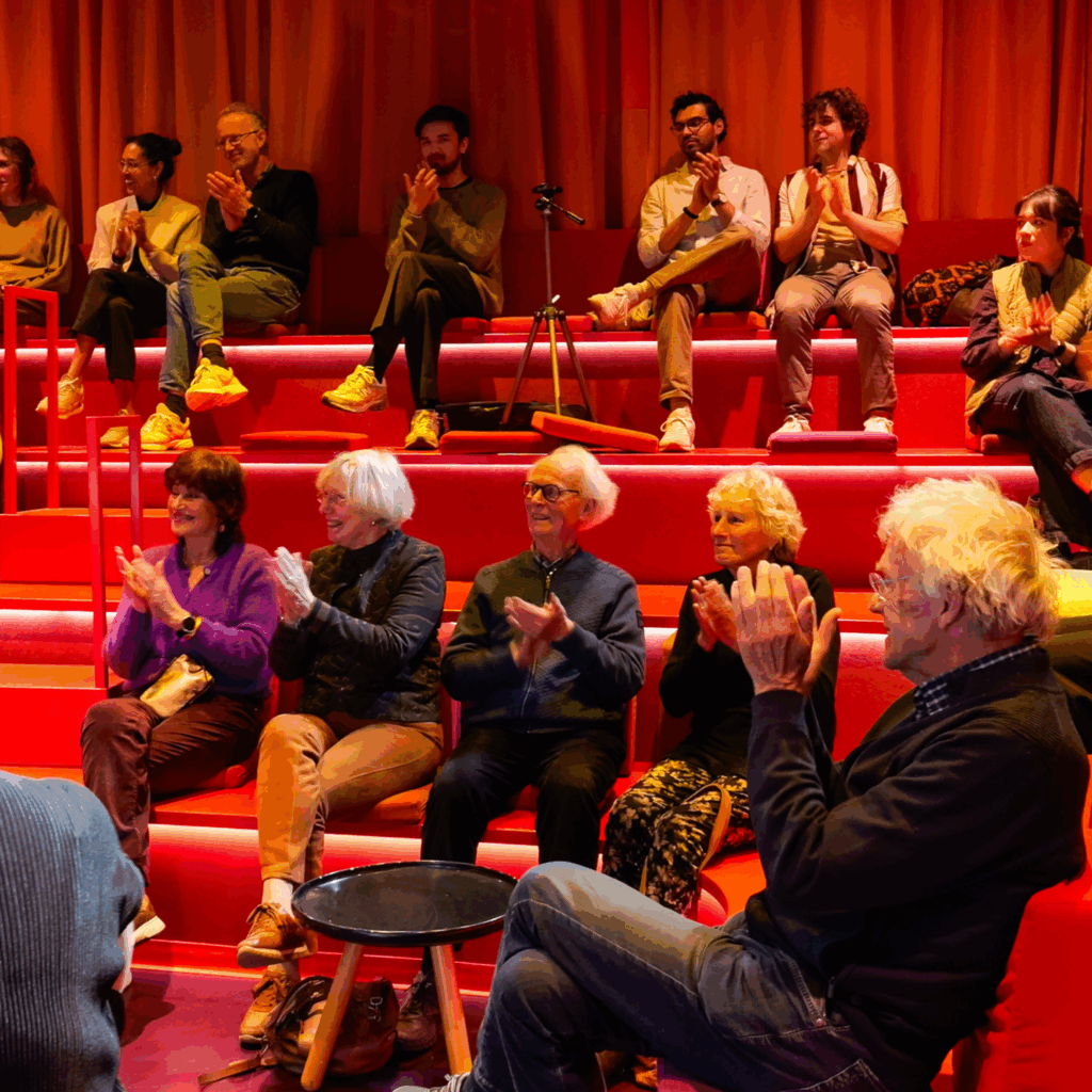
Yes. Events here regularly combine rooms depending on programme needs: plenary sessions in the grand space, breakouts in the white space, a private working lunch in the library, closing drinks in the cafe or garden. We’ll help you think through which combination makes sense for your programme.
Planning well is mostly a matter of asking the right questions early. Flow before programme. Space before capacity. One document before many conversations. A strong close, not just a strong start.
Tell us what you have in mind.