Q&A with Fernando Brízio

Fernando Brízio

This week we are releasing ‘What you see is not’ by Fernando Brízio. A playful combination of function and illusion, a cabinet has been reduced to its two-dimensional image, leaving only one three-dimensional detail intact—an open drawer, perfect for a book or two. A playful combination of function and illusion that saves material too. Here’s our interview with the Lisbon-based designer, Fernando.

What drew you to work with illusion?
In the Buster Keaton short film, The High Sign, Buster takes a can of paint and a brush, draws a hanger, and hangs his hat on it. When I saw the film, I immediately pictured myself doing that exact same gesture. In that scene, Buster performs what designers do—he makes a drawing that becomes a “useable” object.

Can you explain the concept of this piece?
What you see changes when you move around this object. In a certain position you see a conventional cabinet with an open drawer, but when you move sideways it becomes a flat, somehow deformed image, and the archetypal reference of a cabinet is lost. Is it a cabinet with a drawer? Or is it just a suspended drawer?

What you see is not | Droog Furniture | by Fernando Brízio

What role does illusion play in your work?
The illusion in this piece creates a situation where you observe the object’s form and deform, depending on your position in space. I am interested in this type of interaction between the object and the viewer—what you see is a result of who you are, how you think and how you are mentally and physically constituted.

How do you like to see people interact with this piece?
I like to watch people search for the point of view, when for them, the cupboard seems to be “right,” sometimes covering one eye with their hand to get it perfect. There is a French expression – “ça tape à l’œil”- literally meaning “it hits the eye”. It does not only interest me that my work “hits the eye,” but also that it challenges the mind and our perception of reality.

Woolfiller is top invention

Heleen Klopper

Woolfiller by Heleen Klopper, the kit for repairing your moth-eaten sweaters, furniture and carpets has been named one of the top 50 Best Inventions of 2010 by TIME Magazine.

When we asked Heleen what she thinks of it being named an “invention” she said, “It’s a small big step. I apply an old technique as a new repair method.”

“Woolfiller invites people to be self-reliant and creative. This meets topical issues such as economy and climate change,” says Heleen.

The kit is available at Droog Amsterdam and right here.

Q&A with Ida van Zijl, Centraal Museum Utrecht

Why did Centraal Museum acquire the Red blue Lego chair?

Firstly, because it is inspired by Rietveld who is the most important artist in our collection, and secondly, because we are interested in the more conceptual branch of design. We were the first museum to buy the Droog collection, already in the 90s. The Red blue Lego chair is the perfect combination of these two aspects.

Ida van Zijl

How do you see the piece in relation to the work of Rietveld?

I see more value in the artistic qualities of this chair than in its industrial aspect—in its promise of having people do-it-themselves. I believe Rietveld valued the spatial aspect of design as much as he valued the principles of mass production.

I don’t think it is realistic that people will buy their own Lego pieces to make it, but to me, that doesn’t matter. It is the intention and meaning that counts. It stimulates people to think about design and what it means to them.

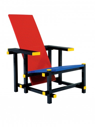
Red blue lego chair by Mario Minale

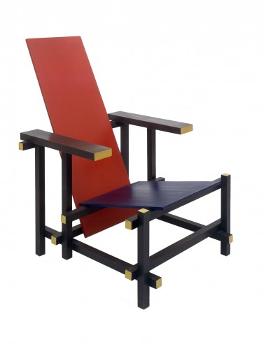
Red and Blue Chair by Gerrit T. Rietveld (1918),  Red blue Lego chair by Mario Minale (2004).

How do you see the chair in relation to movements in the world today?

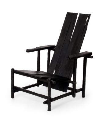
I think it’s better to compare the Red blue Lego chair to the Smoke version by Maarten Baas (that’s also how we show it at the Rietveld’s Universe exhibition). Rietveld was a master that made and continues to make people think about design. His presence in works by contemporary designers and in design discussions shows the actual value of Rietveld today. To me, that is the most important value of this piece.

Smoke chair by Maarten Baas

Smoke chair by Maarten Baas (2004)

Q&A with Mario Minale

Centraal Museum Utrecht acquired the artist’s proof #1 edition of Red blue Lego chair from our collection. It will be exhibited at Rietveld’s Universe as part of Rietveld Year organized by the Centraal Museum in Utrecht to celebrate the life and heritage of Gerrit Rietveld from October 20th, 2010 until January 30th, 2011. Here is our Q&A with Rotterdam-based designer, Mario Minale of Minale-Maeda (pictured with Kuniko Maeda).


Minale-Maeda

What was your starting point for this chair?

There is this expression in the world of theatre, “breaking the fourth wall.” It’s about bringing in something unexpected. It’s about addressing the audience, taking them out of their lull and involving them, even passing the responsibility onto them.

What I don’t like about icons is that we just accept them, and we no longer know what they mean, and then they are copied time and time again. I was looking for something unexpected in making a copy of an icon. I wanted to break the mould and no longer see an icon as something set in stone.
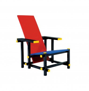
Red blue lego chair | Droog studio work | by Mario Minale

What was “the fourth wall” in your design?

It was the appropriation of two icons in a way that creates something new. I started with Rietveld’s iconic Red blue chair and brought in equally iconic Lego blocks, and I think because the spirit of Rietveld and of Lego aligned, it created a breed that resonates.

Why did you work with Rietveld’s chair?

Rietveld intended his chair to be a blueprint from which anyone could make his own chair out of readily available material. For Rietveld, variations of his design were intended. That is why the construction of his chair is so simple. There are no dovetails or other complicated joinery.

Why did you bring in Lego?

Lego represents the construction material of our age—it is convenient. It makes personal expression easy. It is a material that empowers the unqualified to create by themselves.

For Rietveld, it was boards cut to size at the sawmill that made his design accessible. One no longer had to go to the woods to chop a tree thanks to industry. For us, it is no longer about cutting and sawing, but rather about blocks that snap together, shiny finish included. Rietveld broke the chair into 14 pieces to make it easy. Lego breaks it into 4445 pieces, which makes it even more easy.

Was it in fact easy to make this chair?

Not at all. Lego is a basic toy, but the process of making a chair out of it became so complicated that it questioned the simplicity that Lego promised. The process I went through makes the chair an even more authentic copy. The result of making a copy is not a copy. It’s an authentic act.

Lego has the same tension. It stands for simplicity, but the moulds to make Lego are a best kept secret, and that’s why there are no knock-offs. One cannot get rid of complexity but can only displace it. This chair is a metaphor for that.

What do you think of the copyright laws that prevented a larger production of the Lego chair?

One cannot get the Rietveld chairs anymore. Finding a way to copy it makes it accessible, and this was my intention. The fact that copyright laws prevented us from making a larger production of the Red blue Lego chair intensifies this discussion.

Q&A with Sam Hecht

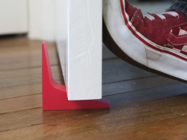
This week we have released Twin Stopper by Sam Hecht of Industrial Facility. Simply clever, Twin stopper has asymmetrical ends to deal with varying gaps between doors and floors in a compact way. Whatever you are using now, this will certainly be more elegant, not to mention safer.

Sam Hecht

Could you tell us about the philosophy behind your work?

The philosophy is simple. The world we inhabit; the people who inhabit it; the things people use to inhabit it. None of these are better or worse than the other. They are all equal. When you reach this realisation it means that a chair is no more or less important than the person sitting on it, or the room it sits in. So for a doorstop, it should relate to the door as much as relating to the room and the feet walking past.

What are your influences?

Conversations are undoubtedly my biggest influences. I have many and continue to use them as a basis for reasoning.

What was your inspiration behind the Twin stopper?

One can say a doorstopper is extremely banal. It has been with us for so long. But, what can often frustrate people about them is that the wedge inevitably sticks out too much because of the varying gap between the door and the floor, and you trip over them. To generate the form, I took a regular doorstop, cut it in half and attached both ends at right-angles. Depending on the gap size, you can turn it and the doorstop will always stay close to the door.

Twin stopper - red | Droog Accessories

How do you think the Twin stopper relates to Droog?

The way I like to think of Droog is that they interject with issues of everyday life—dealing with doorbells, tablecloths, and now a doorstopper. I like the unpretentious side of Droog, and I like that one does not have to think too much about buying the Twin stopper because it is affordable. It’s a small interjection – nothing too dramatic – but it at least it makes a little bit of improvement on what’s gone before.

How do you see that your work relates to various design trends today?

There are many products that keep coming out where their starting point is novelty. It seems designers have forgotten the original purpose of what they are designing. I personally tested the doorstop for over a year. It is what it is because of how it works and not all because of how it looks.

Do you have a message to young product designers?

In some ways, it’s better to apply one’s mind to forgotten objects–the things we “use” everyday, rather than the things we “look at”. The effect on the world is of improving it ever so slightly without using a lot of resources. I think Droog has always been an inspiration to young designers because they negated the bourgeois in favour of democratic creativity. Young people could finally relate to a type of design that related to them as individuals.

Twin stopper is now available in red and black silicone at Droog Amsterdam and on Droog’s online store for € 12.50 for a set of two.

Droog 2: our second magazine

Our second issue of the Droog magazine is out now, with news about Milan 2010, the Droog Townhouse, Pioneers of Change and more. Flip through it here, and pick up a copy at Droog Amsterdam.

Q&A with Christophe Coppens

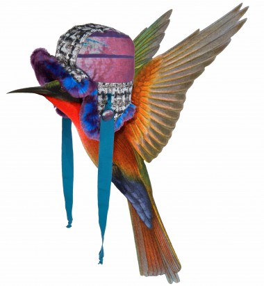
christophe coppens droog

Christophe Coppens’ 2010-2011 Winter collection is on view at Droog Amsterdam until October 17th and at Droog New York until September 25th.

Why is your collection about exotic birds?
In difficult times people should take over the best qualities of birds: the protection of the nest and feathers, the beauty of their colours, their freedom.
How does this collection relate to your past or future body of work?
I have always worked around the theme of protection. Accessories are often there to protect you, against the elements and against the bad bad world. As for the future, we’ll see!
What influence does your role as theatre actor and director have on your work?
My education always follows me with everything I do. I cannot create without thinking of the setting, the soundtrack, the lighting…
What’s next for you?
I’m in Paris next week. I’m working on hats for Manish Arora show. And much more, that is too early to talk about now.
Any thoughts about Droog?
I have always been a fan of Droog, since the beginning. They have always been very strong and consistent in everything they do. I am proud they invited me.
christophe coppens droog