Year: 2010
Q&A with Marcel Schmalgemeijer
Droog Las Vegas opened on December 15th. We asked the designer, Marcel Schmalgemeijer a few questions.
What inspired the design?
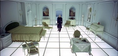
I had to think of the room with the light floor that is in the Stanley Kubrick movie ‘2001: A Space Odyssey’ (1968). The floor visually elevates the furniture that is placed onto it and you get an enstranging atmosphere when you walk on it.
Can you tell us about the concept?
The key aspect is a strong gesture that is simple, basic and white. It is in stark contrast to Las Vegas, where as I see it, everything is a bit too much. Here the whiteness of the space gives space to the products. They have to do the show…
How do you think the design relates to Droog?
The white and basic aspect relates a bit to Droog. But especially I think the design gives very much space to the products. They have to do the show.
How does this store relate to your body of work?
Simple, basic, a big gesture, and a strong atmosphere.
Though Droog Las Vegas is officially Marcel’s first store design, he designed the 100 dollars or less pop-up store at Pioneers of Change, a festival of Dutch design, fashion and architecture curated by Renny Ramakers in September 2009.
Q&A with Renny Ramakers about Droog Las Vegas
Many are surprised to hear Droog is opening in Las Vegas.
Why Las Vegas?
The Cosmopolitan of Las Vegas approached us. Initially it’s hard to see the common ground between Droog and Las Vegas, but for both, experience is important. For us it is interesting to reach a new audience, and Las Vegas is truly a unique place in the world. Sometimes reality can be wilder than fiction.
What do you think of the kind of design you see there?
One sees a totally different type of design. I believe the audience is ready for a new approach, one that establishes new borders between the design and the non-design world.
What about the themed approaches in Las Vegas?
The themed experiences are old-fashioned. You can see Las Vegas is looking for new experiences, and The Cosmopolitan of Las Vegas is breaking some new ground. But it was already happening in 2002, for example with the Guggenheim Hermitage Museum by Rem Koolhaas. Perhaps then it was too early, and now might be a better time for new developments.
What are your impressions of Las Vegas?
Whether you are eating, watching a performance at a theatre, shopping or gambling, everything in Las Vegas is about entertainment. Such a concentration of entertainment is an interesting model for me.
Any thoughts on gambling?
If one can restrict oneself, gambling can be very playful.
Can you tell us about the store design?
With each store location we take a different approach. For Droog Las Vegas, our brief to the designer, Marcel Schmalgemeijer, was that it should be a strong gesture but at the same time, be very functional. Seems obvious, but it is important that the store looks and functions like a store. We want the design to allow the products to speak for themselves and to create an experience.
Are there any future plans for the store?
There will be a program of events and new collaborations with the local context. We have some ideas so far, but are also looking forward to what Las Vegas will inspire.
Droog Las Vegas opened yesterday. See store details here.
A three-star-performance for the holidays!
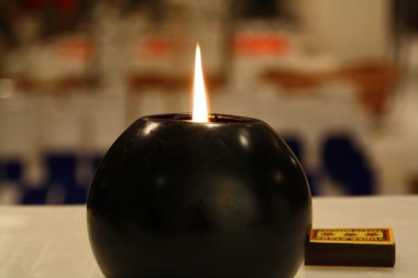
This winter, ignite this candle bomb (don’t worry, it’s safe) and as it melts, watch three bronze star brooches appear. They’re perfect for holiday wear.
Three stars bomb! by Atelier Ted Noten is available in our online store.
One of our favourite quotes
It’s two days before the opening of Droog Las Vegas–a great moment to pull up one of our favourite quotes by John Unwin, CEO of The Cosmopolitan of Las Vegas as published by Travel + Leisure:
John Unwin has been giving me a hard-hat tour of the Cosmopolitan for the better part of an hour, pointing out the “casino cabanas” and the lobby columns patterned in high-definition video screens. But it’s not until we reach the building’s eastern edge, where it opens onto the sidewalk of the Las Vegas Strip, that I realize just how different it’s going to be. “We’re going to put a Droog in this corner,” the hotel’s CEO tells me. A what? “You know: Droog, the Dutch design store. Slots would make more money, but I think Droog is cooler.”
Read the full article here.
Interview with Renny by KLM’s iFly magazine
Watch a recent interview with Renny Ramakers by KLM’s iFly magazine.
“I am not an idealist by any means. It is not my goal to create social design, but I do like it when social renewal results in innovative design.” – Renny Ramakers
Q&A with Peter van der Jagt
This week Bottoms up doorbell is back in stock after an improved production. We asked the designer, Peter van der Jagt about the design, which he came up with as a student at Hogeschool voor de Kunsten Arnhem.
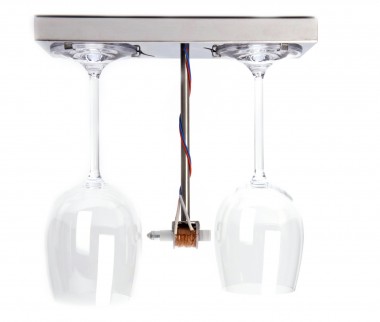
Here’s what he said:
When I was studying, a strange thing happened. I actually became tired of design. And I was not the only one.
What’s the use after all, when fashion creeps in? What’s the use in assigning a colour when, before you know it, it is “so last year”? What’s the use in designing a shape if, within two years, it reminds you of something from way back when?
We thought we had the solution: we simply didn’t design anymore. We just had a good idea and prototyped it, without sketching or deciding on colour, shape or other aesthetic characteristics. The prototype thus became the product instantly. After all, if it can be made once by a student, it could be made many times by anyone, right? (Admittedly, in hindsight, this turns out to be a bit naïve).
This kind of thinking drove the design of Bottoms up doorbell. We were concerned with how the product could tell a story—not a fairy tale or a multi-layered, symbol-ridden social statement—but the story of the product itself.
What is a doorbell? Every single doorbell is a collection of electric parts that release a hammer so it hits two objects emitting a two-tone sound, in order to announce the arrival of company at the door.
Most doorbells are white plastic cubes that say nothing. Nothing about the technique, nothing about how they work, nothing about what a pleasant sound is, or how hospitality is expressed.
I designed the Bottoms up doorbell in 1994. 16 years later, the product is still current. Perhaps as a classic, but not out of nostalgia. Of course design, and the thoughts driving design have evolved, and I think for the better. Nevertheless, not wanting to design wasn’t such a bad idea after all.
The Bottoms up doorbell is available here.
Do good
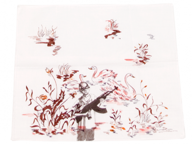
This holiday, do something good by purchasing Sad hanky by Sofie Lachaert and Luc d’Hanis for yourself or for someone else. With every purchase, € 4,- goes towards War Child programmes to strengthen the resilience of children in (post) war areas.
Read more about War Child here.
Sad hanky is available here.
Christophe Coppens is purveyor to Court of Belgium
Christophe Coppens has newly been appointed as purveyor to the Court of Belgium.
According to a long established tradition, the list of people whom His Majesty King Albert II appoints as purveyors to the Court of Belgium is determined once a year. In 2010, Coppens was one of the three establishments appointed to the services of the Court. What an honour!
Visit Droog Amsterdam to see the Christophe Coppens 2010-2011 Winter Collection.
Droog Las Vegas is opening soon
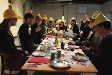
We celebrated the upcoming opening of Droog Las Vegas in partnership with The Cosmopolitan of Las Vegas with a cake from Bakker Baard. Yummy!
Let it snow
This was the Tree trunk bench in the Droog Amsterdam courtyard on Saturday. As is usual in Holland, the rain took the snow away on Sunday.
Q&A with Fernando Brízio
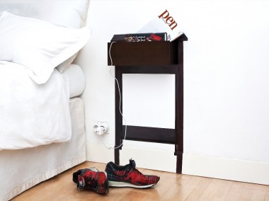
This week we are releasing ‘What you see is not’ by Fernando Brízio. A playful combination of function and illusion, a cabinet has been reduced to its two-dimensional image, leaving only one three-dimensional detail intact—an open drawer, perfect for a book or two. A playful combination of function and illusion that saves material too. Here’s our interview with the Lisbon-based designer, Fernando.
What drew you to work with illusion?
In the Buster Keaton short film, The High Sign, Buster takes a can of paint and a brush, draws a hanger, and hangs his hat on it. When I saw the film, I immediately pictured myself doing that exact same gesture. In that scene, Buster performs what designers do—he makes a drawing that becomes a “useable” object.
Can you explain the concept of this piece?
What you see changes when you move around this object. In a certain position you see a conventional cabinet with an open drawer, but when you move sideways it becomes a flat, somehow deformed image, and the archetypal reference of a cabinet is lost. Is it a cabinet with a drawer? Or is it just a suspended drawer?
What role does illusion play in your work?
The illusion in this piece creates a situation where you observe the object’s form and deform, depending on your position in space. I am interested in this type of interaction between the object and the viewer—what you see is a result of who you are, how you think and how you are mentally and physically constituted.
How do you like to see people interact with this piece?
I like to watch people search for the point of view, when for them, the cupboard seems to be “right,” sometimes covering one eye with their hand to get it perfect. There is a French expression – “ça tape à l’œil”- literally meaning “it hits the eye”. It does not only interest me that my work “hits the eye,” but also that it challenges the mind and our perception of reality.
Woolfiller is top invention
Woolfiller by Heleen Klopper, the kit for repairing your moth-eaten sweaters, furniture and carpets has been named one of the top 50 Best Inventions of 2010 by TIME Magazine.
When we asked Heleen what she thinks of it being named an “invention” she said, “It’s a small big step. I apply an old technique as a new repair method.”
“Woolfiller invites people to be self-reliant and creative. This meets topical issues such as economy and climate change,” says Heleen.
The kit is available at Droog Amsterdam and right here.
The newest owner of Glass arrangement
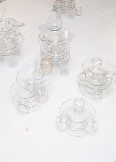
Design Museum Gent has acquired Glass Arrangement #13/15 by Atelier Remy & Veenhuizen. This still life centrepiece was originally presented at our saved by droog. presenation in Milan early this year.

