Q&A with designer Nikkie Wester
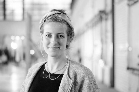
Nikkie Wester, is a Dutch textile product designer with a great passion for craftmanship and folklore. Her work always follows comprehensive research into cultural traditions, rituals and its origin, which is expressed in experiments with different textile materials. A great part of her designs infuse colour and symbolic references – and we got talked with her about her latest designs – the Fiske Fish Socks, which she designed upon learning about her own family history.  www.nikkiewester.com

Fish Socks by Nikkie Wester from Nikkie Wester on Vimeo.

You can purchase the Fiske Fish Socks at the Droog Shop at Staalstraat 7B – now open from 9am-7pm everyday.


Orange Socks (Women’s Sizes): €59,95 – Sizes 36-41

Grey Sock (Men’s Sizes)s: €64,95 – Sizes 41-46

We talk with Nikkie in an exclusive interview about her latest designs:

The Fiske Fish Socks are very playful, do you often weave play into your designs?My work has always been very conceptual, to keep it light-hearted I use humour. Without a twist, a collection can turn out to be too serious or heavy and therefore unattainable for public.

How long does it take to make a pair of Fiske fish socks?

The socks are knitted by hand, that can be a slow process though the women who do that work very quick. The can make a pair of socks in a day. I admire their knitting skills, they truly master the craft.

What is the name of the knitting technique used in the Fiske fish sock?The socks are knitted in a cable stich. This particular stich was used to make the traditional fishermen attire. By the use of this cable the textile becomes both breathable and insulating, which makes it perfectly suitable for rough weather at sea and therefore very suitable for socks to keep your feet warm

How did you develop an interest in textiles and knitting, and why does it interest you?Textile is a fascinating product because it is inseparable with humanity. It is used from the moment we are born, when we dry nurse our baby’s, until death. Even then we wrap textile around our loved ones before we give them back to the earth.

What kind of textile projects excite you the most? I am fascinated with projects that require textile products that have to do with cultural heritage. This can for example be a research upon a traditional costume or a spatial design meant to unite a group of people.

Do you think the art of knitting is in decline or on the rise based on the growing tech-culture?There is always been research and development considering textile, so also on the craft of knitting. Though at the moment innovation is concentrating more on the development of materials. The century old technique of knitting is tested upon these new materials. That is the beauty of knitting. It is a technique that managed to survive the test of time. Of course this is not without a reason. The possibilities are endless and applicable on almost all materials. So I have complete confidence in the future of knitting.

Finally, the most important question, do you have inspirational pet fish that started this project?Haha, no the design is not that square. The fish socks are developed from a research upon the Dutch textile identity combined with a research upon my own family history. I wanted to make a twist to the fishery and combined it with a photo of my grandfather as a child. On the photo I drew socks with a fin at the end. That was the start of the design, although of course it was still in development. I find it very exciting that the product is now realised and put into production. That is one of the reasons I design.

My cup of thoughts

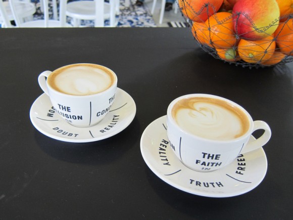
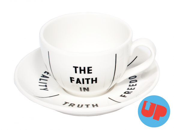
my cup of thoughts Drinking coffee is often used as a moment for reflection or communication. By rotating the cup on the saucer, the different word combinations provide “food for thought”. A true conversation piece. As designer Annelys de Vet stated: “They playfully question our changing perceptions of subjects like freedom and truth, inviting the consumer to make up their own mind.”

My cup of thoughts is a product from UP by Droog. Read more.

My cup of thoughts by Annelys de Vet

Q&A with Annelys de Vet, designer of My cup of thoughts

What is the idea behind your design for the coffee cups?
Drinking coffee is often used as a moment for reflection and communication. The English author Sydney Smith mentioned that “If you want to improve your understanding,” you should “drink coffee”. And Sheik Abd-al-Kadir, (10th century), confessed that “no one can understand the truth until he drinks of coffee’s frothy goodness.” Coffee is seen as a symbol for improving our erudition, and futures can be predicted in the leftovers. It’s within this realm that the texts on the cups and saucers provide food for thought. They playfully question our changing perceptions of subjects like freedom and truth, inviting the consumer to make up their own mind.

How did you experience working with ‘deadstock’ instead of designing a product from scratch?
It was my reason for accepting the invitation for this project. We – in the west – are massive consumers of goods, resources and food. If we want a qualitative future we seriously have to change our consumerism and our mentality. A project like ‘UP’ contributes to this urgent need for change.

Due to an increase in environmental consciousness in today’s society, a lot of waste is recycled or ‘upcycled’. What do you think of this?
This is of the utmost importance, and designers can play a very meaningful role here. They are specifically trained to see doors where other people see walls.

We’ve often heard ‘design can save the world’. Tell me your thoughts?
Of course it’s utterly naïve to believe that design can save the world, and it would be self-congratulatory to think that designers have this ability. Global problems are becoming too complex, layered and with too many irreversible realities. At first it needs a global mentality-change, alternative economies and utopian power structures. But what arts and culture – and thus design – can do, is provide “food for thought” for this changing perception. They can help to shift our perspectives and develop tools to understand our reality and deal with it in a more sustainable way.

Q&A with Marcel Schmalgemeijer

Droog Las Vegas opened on December 15th. We asked the designer, Marcel Schmalgemeijer a few questions.

What inspired the design?

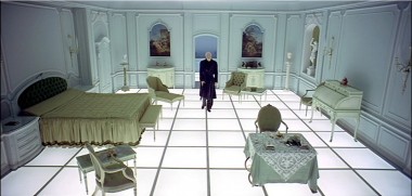
I had to think of the room with the light floor that is in the Stanley Kubrick movie ‘2001: A Space Odyssey’ (1968). The floor visually elevates the furniture that is placed onto it and you get an enstranging atmosphere when you walk on it.

Can you tell us about the concept?

The key aspect is a strong gesture that is simple, basic and white. It is in stark contrast to Las Vegas, where as I see it, everything is a bit too much. Here the whiteness of the space gives space to the products. They have to do the show…

How do you think the design relates to Droog?

The white and basic aspect relates a bit to Droog. But especially I think the design gives very much space to the products. They have to do the show.

How does this store relate to your body of work?

Simple, basic, a big gesture, and a strong atmosphere.

Marcel Schmalgemeijer

Though Droog Las Vegas is officially Marcel’s first store design, he designed the 100 dollars or less pop-up store at Pioneers of Change, a festival of Dutch design, fashion and architecture curated by Renny Ramakers in September 2009.

Q&A with Renny Ramakers about Droog Las Vegas

Las Vegas

Many are surprised to hear Droog is opening in Las Vegas.
Why Las Vegas?

The Cosmopolitan of Las Vegas approached us. Initially it’s hard to see the common ground between Droog and Las Vegas, but for both, experience is important. For us it is interesting to reach a new audience, and Las Vegas is truly a unique place in the world. Sometimes reality can be wilder than fiction.

What do you think of the kind of design you see there?

One sees a totally different type of design. I believe the audience is ready for a new approach, one that establishes new borders between the design and the non-design world.

What about the themed approaches in Las Vegas?

The themed experiences are old-fashioned. You can see Las Vegas is looking for new experiences, and The Cosmopolitan of Las Vegas is breaking some new ground. But it was already happening in 2002, for example with the Guggenheim Hermitage Museum by Rem Koolhaas. Perhaps then it was too early, and now might be a better time for new developments.

What are your impressions of Las Vegas?

Whether you are eating, watching a performance at a theatre, shopping or gambling, everything in Las Vegas is about entertainment. Such a concentration of entertainment is an interesting model for me.

Any thoughts on gambling?

If one can restrict oneself, gambling can be very playful.

Can you tell us about the store design?

With each store location we take a different approach. For Droog Las Vegas, our brief to the designer, Marcel Schmalgemeijer, was that it should be a strong gesture but at the same time, be very functional. Seems obvious, but it is important that the store looks and functions like a store. We want the design to allow the products to speak for themselves and to create an experience.

Are there any future plans for the store?

There will be a program of events and new collaborations with the local context. We have some ideas so far, but are also looking forward to what Las Vegas will inspire.

Droog Las Vegas opened yesterday. See store details here.

Q&A with Peter van der Jagt

This week Bottoms up doorbell is back in stock after an improved production. We asked the designer, Peter van der Jagt about the design, which he came up with as a student at Hogeschool voor de Kunsten Arnhem.
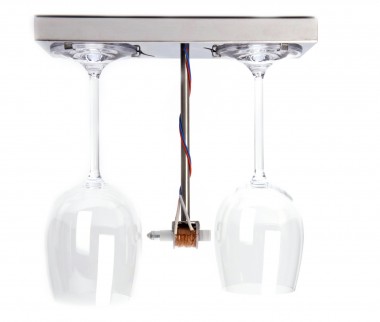
Bottoms up doorbell for Droog by Peter van der Jagt

Here’s what he said:

When I was studying, a strange thing happened. I actually became tired of design. And I was not the only one.

What’s the use after all, when fashion creeps in? What’s the use in assigning a colour when, before you know it, it is “so last year”? What’s the use in designing a shape if, within two years, it reminds you of something from way back when?

We thought we had the solution: we simply didn’t design anymore. We just had a good idea and prototyped it, without sketching or deciding on colour, shape or other aesthetic characteristics. The prototype thus became the product instantly. After all, if it can be made once by a student, it could be made many times by anyone, right? (Admittedly, in hindsight, this turns out to be a bit naïve).

This kind of thinking drove the design of Bottoms up doorbell. We were concerned with how the product could tell a story—not a fairy tale or a multi-layered, symbol-ridden social statement—but the story of the product itself.

What is a doorbell? Every single doorbell is a collection of electric parts that release a hammer so it hits two objects emitting a two-tone sound, in order to announce the arrival of company at the door.

Most doorbells are white plastic cubes that say nothing. Nothing about the technique, nothing about how they work, nothing about what a pleasant sound is, or how hospitality is expressed.

I designed the Bottoms up doorbell in 1994. 16 years later, the product is still current. Perhaps as a classic, but not out of nostalgia. Of course design, and the thoughts driving design have evolved, and I think for the better. Nevertheless, not wanting to design wasn’t such a bad idea after all.

The Bottoms up doorbell is available here.

Peter van der Jagt

Q&A with Fernando Brízio

Fernando Brízio

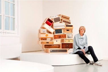
This week we are releasing ‘What you see is not’ by Fernando Brízio. A playful combination of function and illusion, a cabinet has been reduced to its two-dimensional image, leaving only one three-dimensional detail intact—an open drawer, perfect for a book or two. A playful combination of function and illusion that saves material too. Here’s our interview with the Lisbon-based designer, Fernando.

What drew you to work with illusion?
In the Buster Keaton short film, The High Sign, Buster takes a can of paint and a brush, draws a hanger, and hangs his hat on it. When I saw the film, I immediately pictured myself doing that exact same gesture. In that scene, Buster performs what designers do—he makes a drawing that becomes a “useable” object.

Can you explain the concept of this piece?
What you see changes when you move around this object. In a certain position you see a conventional cabinet with an open drawer, but when you move sideways it becomes a flat, somehow deformed image, and the archetypal reference of a cabinet is lost. Is it a cabinet with a drawer? Or is it just a suspended drawer?

What you see is not | Droog Furniture | by Fernando Brízio

What role does illusion play in your work?
The illusion in this piece creates a situation where you observe the object’s form and deform, depending on your position in space. I am interested in this type of interaction between the object and the viewer—what you see is a result of who you are, how you think and how you are mentally and physically constituted.

How do you like to see people interact with this piece?
I like to watch people search for the point of view, when for them, the cupboard seems to be “right,” sometimes covering one eye with their hand to get it perfect. There is a French expression – “ça tape à l’œil”- literally meaning “it hits the eye”. It does not only interest me that my work “hits the eye,” but also that it challenges the mind and our perception of reality.

Woolfiller is top invention

Heleen Klopper

Woolfiller by Heleen Klopper, the kit for repairing your moth-eaten sweaters, furniture and carpets has been named one of the top 50 Best Inventions of 2010 by TIME Magazine.

When we asked Heleen what she thinks of it being named an “invention” she said, “It’s a small big step. I apply an old technique as a new repair method.”

“Woolfiller invites people to be self-reliant and creative. This meets topical issues such as economy and climate change,” says Heleen.

The kit is available at Droog Amsterdam and right here.

Q&A with Ida van Zijl, Centraal Museum Utrecht

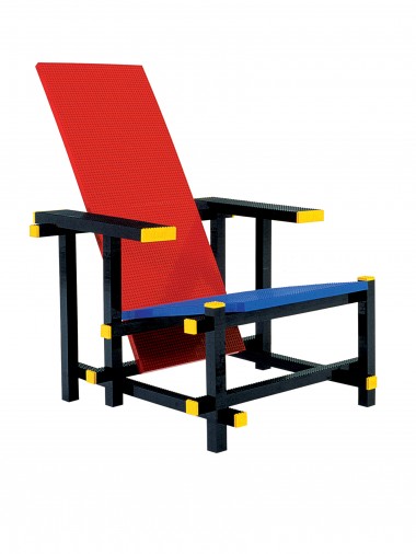
Why did Centraal Museum acquire the Red blue Lego chair?

Firstly, because it is inspired by Rietveld who is the most important artist in our collection, and secondly, because we are interested in the more conceptual branch of design. We were the first museum to buy the Droog collection, already in the 90s. The Red blue Lego chair is the perfect combination of these two aspects.

Ida van Zijl

How do you see the piece in relation to the work of Rietveld?

I see more value in the artistic qualities of this chair than in its industrial aspect—in its promise of having people do-it-themselves. I believe Rietveld valued the spatial aspect of design as much as he valued the principles of mass production.

I don’t think it is realistic that people will buy their own Lego pieces to make it, but to me, that doesn’t matter. It is the intention and meaning that counts. It stimulates people to think about design and what it means to them.

Red blue lego chair by Mario Minale

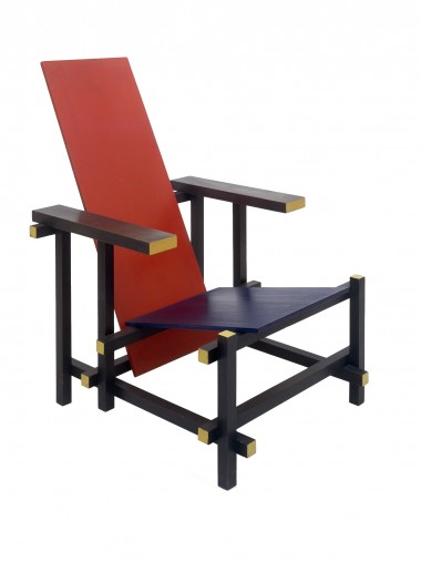
Red and Blue Chair by Gerrit T. Rietveld (1918),  Red blue Lego chair by Mario Minale (2004).

How do you see the chair in relation to movements in the world today?

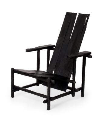
I think it’s better to compare the Red blue Lego chair to the Smoke version by Maarten Baas (that’s also how we show it at the Rietveld’s Universe exhibition). Rietveld was a master that made and continues to make people think about design. His presence in works by contemporary designers and in design discussions shows the actual value of Rietveld today. To me, that is the most important value of this piece.

Smoke chair by Maarten Baas

Smoke chair by Maarten Baas (2004)

Q&A with Christophe Coppens

christophe coppens droog

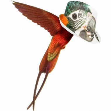
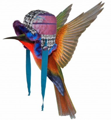
Christophe Coppens’ 2010-2011 Winter collection is on view at Droog Amsterdam until October 17th and at Droog New York until September 25th.

Why is your collection about exotic birds?
In difficult times people should take over the best qualities of birds: the protection of the nest and feathers, the beauty of their colours, their freedom.
How does this collection relate to your past or future body of work?
I have always worked around the theme of protection. Accessories are often there to protect you, against the elements and against the bad bad world. As for the future, we’ll see!
What influence does your role as theatre actor and director have on your work?
My education always follows me with everything I do. I cannot create without thinking of the setting, the soundtrack, the lighting…
What’s next for you?
I’m in Paris next week. I’m working on hats for Manish Arora show. And much more, that is too early to talk about now.
Any thoughts about Droog?
I have always been a fan of Droog, since the beginning. They have always been very strong and consistent in everything they do. I am proud they invited me.
christophe coppens droog